B2B SaaS companies are increasingly investing in affiliate marketing partner programs. In this post, we’ll go through examples of the vendor pages that promote their own affiliate programs, and show how reviews could be woven into them to get more affiliates.
Table of Contents
First, let’s cover the basics of what affiliate marketing is and why it matters in B2B SaaS. Affiliate Marketing is big business, and it’s growing fast. “Affiliates are partners that drive traffic to your properties through tracked links, and earn a cut when that traffic converts” (as defined by PartnerStack). According to Statista (via Ahrefs), U.S. affiliate marketing spend is due to reach $8.2 billion by 2022, up from $5.4 billion in 2017.
Affiliate marketing has its “roots” in B2C (the first affiliate program was made by a flower shop 😉). Today, almost 20% of the affiliate market promotes B2B products and services.
For B2B SaaS, affiliate programs can be a win-win partnership between the content creators who can provide value to a B2B SaaS audience and the vendors who are willing and able to offer commission for sales that come from the people who click on promoted affiliate links.
“In the SaaS niche, the average percentage of the sales price paid to affiliates seems to range between 15 and 25. The modal commission rate is 20%, which you’ve likely come across when assessing different programs.”
Commission rate is one of many elements that affiliates consider before joining an affiliate program. For any company, B2B SaaS or other, it’s common to have a partner/affiliate page on their site to present their affiliate program to affiliates. The common goal of this page is to get the visitor to sign up to be a partner/affiliate in their partner program.
Let’s walk through some examples of how companies are using their partner page to attract more partners/affiliates to their program. In each example, I’ll highlight one actionable takeaway that you can consider applying to your own partner page.
How to Make B2B Affiliate Partner Program Pages That Convert?
To create affiliate marketing partner program pages that convert, i.e. turn website visitors into affiliate partners, it takes a page that has both affiliate program best practices and conversion-centred design.
Unbounce (landing page builder software) has shared its 7 Principles of Conversion-Centered Design to help companies make pages that look good and convert. In this post, we’ll use this Conversion-centred design framework to walk through partner pages that have effectively applied these principles. The 7 principles of Conversion-Centered Design are:
Principle #1: Create Focus – Focus your audience on one goal at a time
Principle #2: Build Structure – Structure your page to influence visitors and guide them to action.
Principle #3: Stay Consistent – Keep your pages consistent with the rest of your brand design guidelines.
Principle #4: Show Benefits – Choose visuals that showcase the benefits of what you’re selling.
Principle #5: Draw Attention – Use your design to draw attention to the elements that matter most (CTA buttons)
Principle #6: Design for Trust – Create social proof like testimonials, customer logos, and review site elements to build visitor confidence and prove credibility.
Principle #7: Reduce Friction – Make it as easy for your visitors to convert.
Using reviews applies one of the 7 Principles of Conversion-Centered Design: “Principle #6: Design for Trust – Create social proof like testimonials and customer logos to build visitor confidence and prove credibility.” Let’s start there and then move on to the other principles of Conversion-Centered Design.
Design for Trust: Leveraging Reviews
Reviews can play an important role in designing pages that build enough trust to get visitors to take action. Here are several examples of B2B software companies that effectively leverage reviews on their affiliate partner program pages.
Takeaway: prove that you’re an industry leader to potential partners by leveraging review site badges or some other form of social proof.
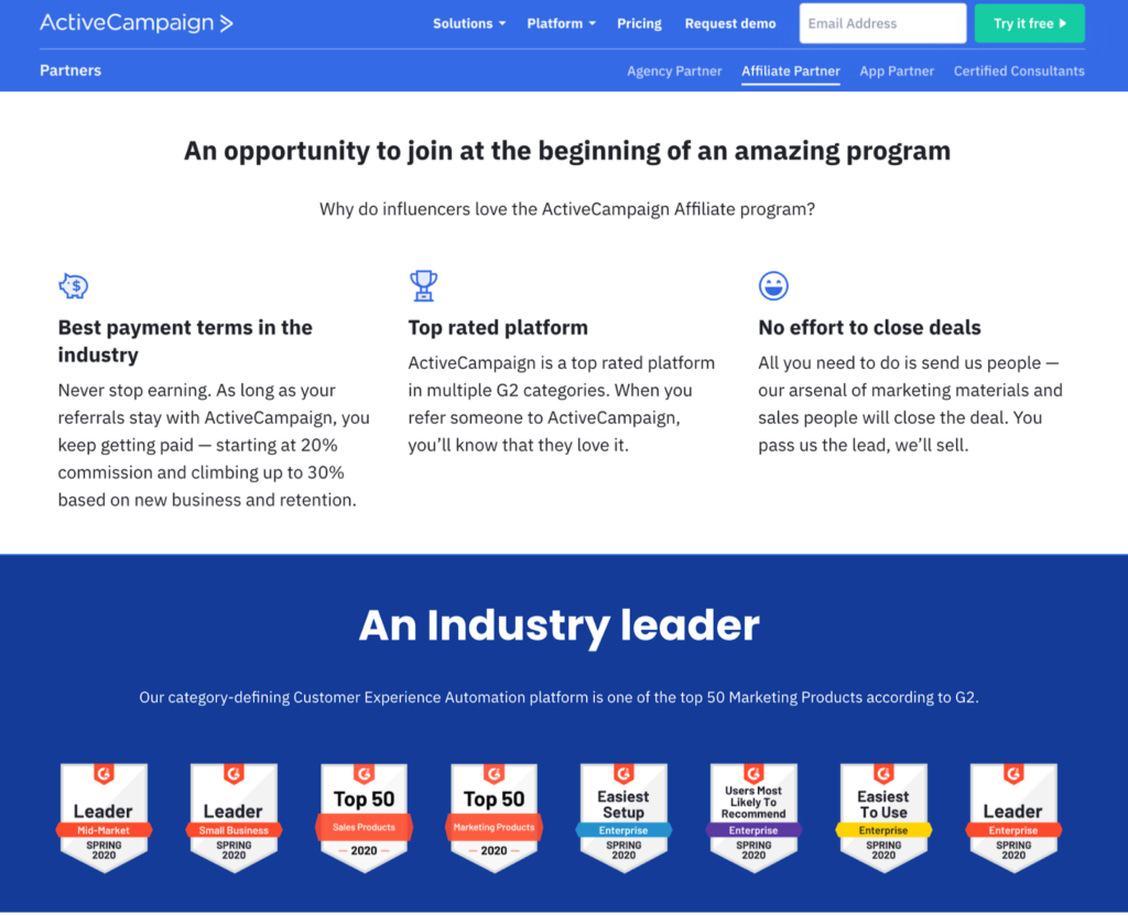
ActiveCampaign makes extensive use of G2 badges on its Affiliate Partner page to support their partner pitch, “Refer your followers to a platform they will actually love…(ActiveCampaign is a) top-rated platform across multiple categories on review sites like G2.”
Not only does this help prove that there’s clear market demand for ActiveCampaign, but also shows that its customers love it. That’s important to affiliates given ActiveCampaign’s affiliate commission rate is up to 30%, recurring for as long as each referred customer remains a customer. That means, “When your referrals are successful on ActiveCampaign, they’ll stick around. Not only do you look like a hero, but you have a commission check you can rely on.”
That’s a message that will resonate with many affiliates.
Takeaway: use review site badges and achievements as social proof of market presence and momentum.
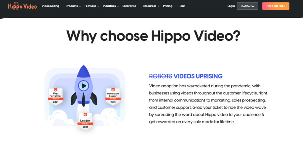
Hippo Video includes three of their G2 badges in the “Why choose Hippo Video?” section of their affiliate page to help support their case. This helps assure the potential partner/affiliate that Hippo Video is a high-performing SaaS company that has a lot of momentum in its software category.
Takeaway: combine your review rating with other relevant figures
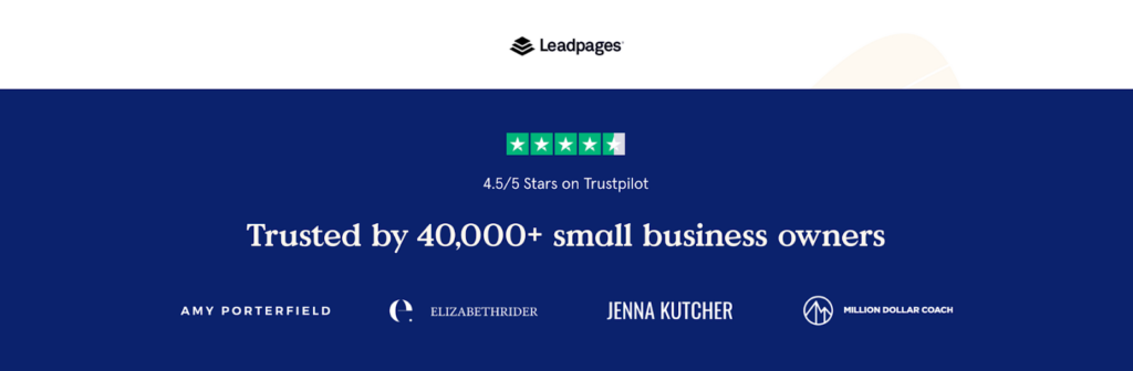
Leadpages strengthens its solid 4.5 rating on TrustPilot by coupling it with the additional social proof of 40,000+ small business owners trusting Leadpages. By using both figures together, Leadpages shows strength in both quantity (of customers) and quality (of customer satisfaction).
Takeaway: Use reviews as social proof to build trust with potential affiliate partners.
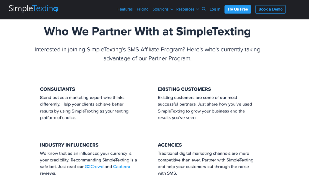
SimpleTexting leverages reviews on its affiliate application page to specifically speak to industry influencers. The message from SimpleTexting to industry influencers is that your currency is your credibility and that recommending SimpleTextung is a safe bet (won’t risk your credibility) because of their customer reviews. SimpleTexting links out to its G2 and Capterra reviews for those industry influencers interested to learn more.
Takeaway: add a section on why your customers love you.
Affiliates want to partner with companies that have a solution that their customers love. Why? Because it makes it easier for the affiliate to market and sell the solution.
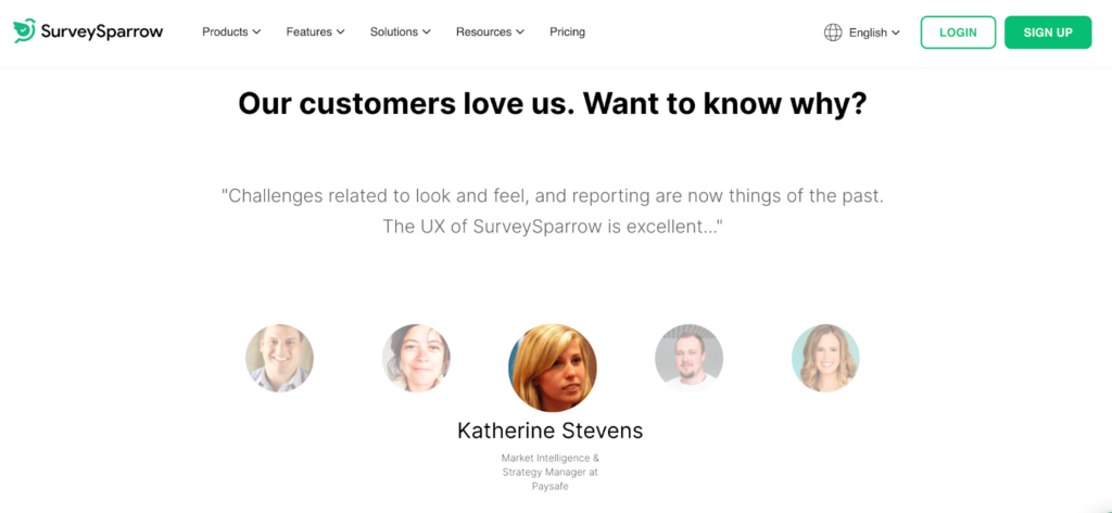
SurveySparrow has a customer testimonial section on its affiliate program page. In it, they highlight specific review snippets/testimonials to show why customers love SurveySparrow. The review snippets/testimonials also give affiliates an initial sense of what they can highlight to potential buyers (e.g. UI look and feel, reporting).
Takeaway: Combine review badges with other badges, like SOC2, to build trust
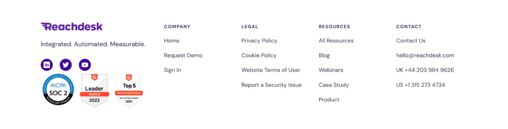
Reachdesk uses a global site section – the footer – to show social proof on all of its web pages, including its partner page. Alongside two G2 badges are a SOC2 badge (compliance and certification of how a vendor securely manages its customer data); strong trust elements to end every page.
Let’s go through more affiliate marketing partner program page examples to see how the other six principles of conversion-centred design, and other affiliate/partner page-specific tips, can be applied to partner pages.
Takeaway: Leverage a template. Consider using a PartnerStack-hosted landing page to leverage a proven partner application page.
Given that the goal of most partner program pages is the same – get affiliates to join the partner program – consider using a template. This is aligned to Principle 2: Build Structure of 7 Principles of Conversion-Centered Design. The information hierarchy of the page will likely be the same if you have the same goal. If you have multiple goals, such as a partner program with multiple programs types, consider creating a custom page.
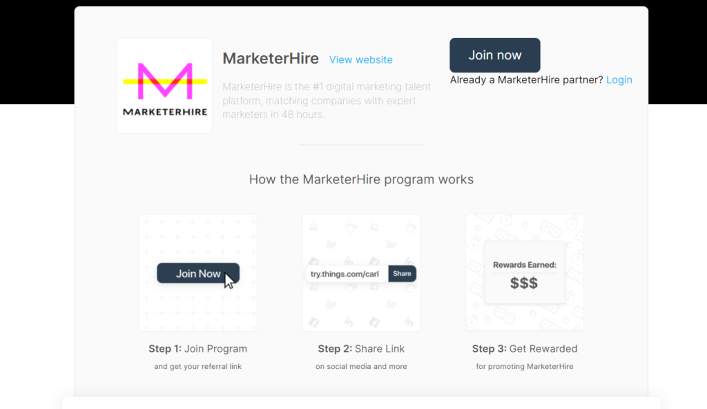
MarketerHire has a link in their footer, “Referral program”, that directs to a partner application page powered by PartnerStack. The information hierarchy of the page structures the page in these four main sections that have been proven to work for hundreds of affiliate partner programs:
The pitch: Make a clear call-to-action to join their affiliate program
How it works: Show affiliates how it works in three easy steps.
Rewards (not pictured): Highlight the commission rate(s)
FAQs (not pictured): Answer the most commonly asked questions of affiliate programs powered by PartnerStack.
Takeaways: Add a Frequently Asked Questions section to your Affiliate partner page. Stay consistent with the look and feel of your partner page.
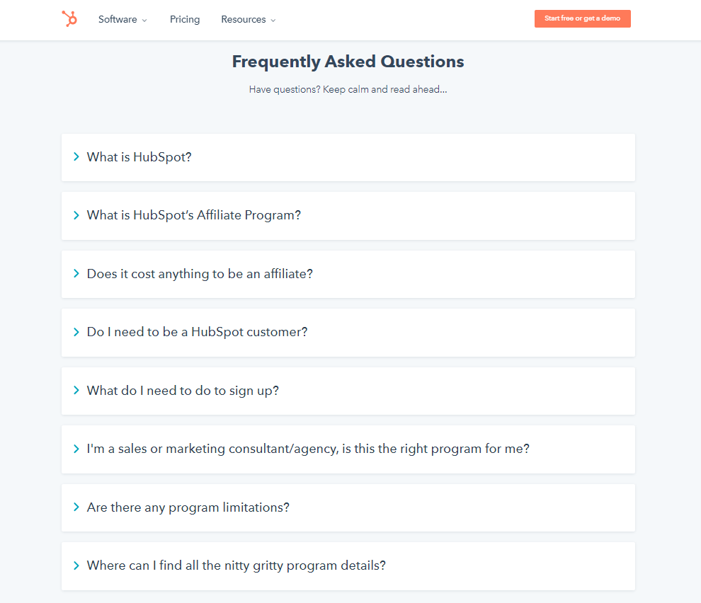
Entice more affiliates to join your program by clarifying any questions or concerns that they might have. HubSpot FAQs section for its affiliate program is clear and comprehensive. Consider using it as a template.
From the 7 Principles of Conversion-Centered Design, HubSpot applies Principle 3: Stay Consistent. The fonts, colours, styles, icons, etc. on the page all feel like any other page on HubSpot, which helps make the affiliate program feel tightly integrated into the business.
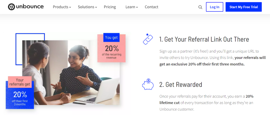
Takeaway: Provide affiliates with a discount offer that they can promote to their audience. Use high colour contrast to draw attention.
Unbounce provides their affiliates with an exclusive 20% off offer (for the first three months) discount that they can provide to their audience (through the affiliate link). This is in addition to the 20% commission (of all recurring revenue) to the affiliate. Making the incentive two-sided increases the appeal of the offer to the affiliate. This is because the financial incentive that the affiliate can pass to the buyer makes Unbounce’s affiliate offer more marketable.
Unbounce applies Principle #5: Draw Attention from its 7 Principles of Conversion-Centered Design. The use of blue (#0827cc) in the CTA buttons against the white (#FFFFFF) has a high colour contrast score of 9.67 which helps draw the visitor’s attention to the buttons.
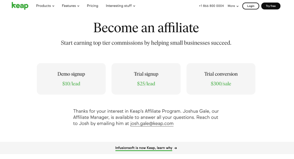
Takeaway: Consider adding a way to contact your affiliate manager to reduce signup friction
Most affiliate pages rely on a form for affiliate candidates to get in touch. Keap provides a signup form and their Affiliate Manager’s email address on their page.
Providing an email address gives visitors another way to convert, which makes it a good example of the seventh principle of Conversion-Centred Design is to “Reduce Friction – Make it as easy as possible for your visitors to convert”.
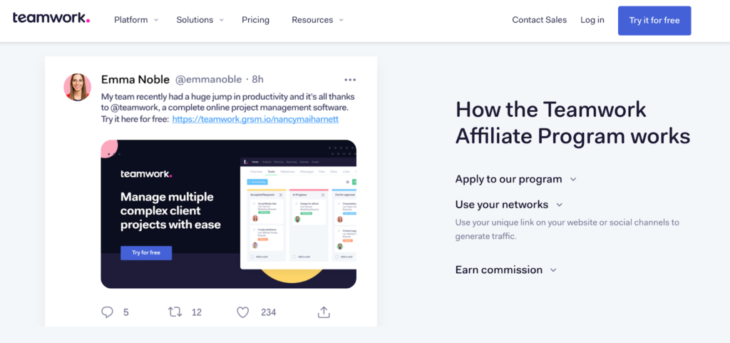
Teamwork’s affiliate program page is world-class, and one of the best things it does is provide visuals to support the copy. They include an example of a tweet to show affiliates how they could easily promote Teamwork to their network (and potentially be rewarded for it).
They also show a custom referral link and a redirect URL to show affiliates who may not be familiar with affiliate marketing how the links work. And last but not least, they show a visual that every affiliate wants to see: commission (revenue) from referrals.
From the 7 Principles of Conversion-Centered Design, Teamwork’s affiliate page is a world-class example of Principle #4: Show Benefits.
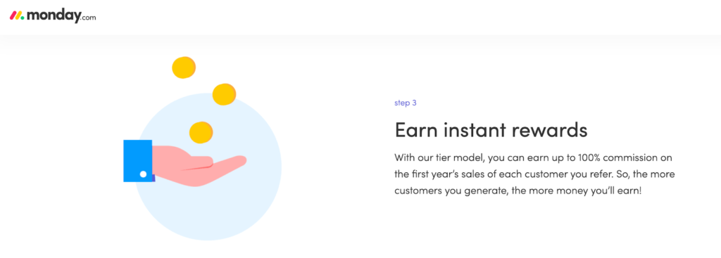
Takeaway: consider a tiered commission model to reward top affiliates with a higher commission rate.
Earning up to 100% commission (on the first year’s sales) of each customer you refer is an eye-catching offer. Tiered commissions will appeal to many affiliates, especially the bigger ones who can drive a high volume of sales.
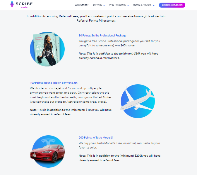
Takeaway: Consider adding bonuses for affiliates when they hit certain performance milestones.
Scribe Media stands out by offering ultra-luxurious bonuses for top ambassadors/affiliates to aspire to for achieving sky-high levels of referral performance. As with Sales professionals, affiliates are in it to make money. These bonuses help signal that Scribe Media is willing to give big bonuses to top performers.
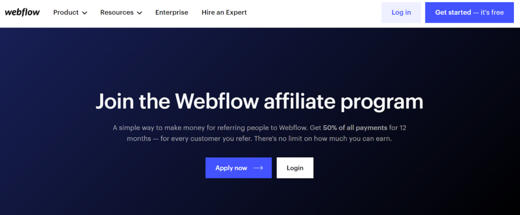
Takeaway: lead with your affiliate offer if it’s above average.
Webflow keeps it simple by highlighting their very appealing commission offer: 50% of all payments for 12 months — with no limits.
Referring back to the intro of this post, according to Supermetrics, “In the SaaS niche, the average percentage of the sales price paid to affiliates seems to range between 15 and 25. The modal commission rate is 20%, which you’ve likely come across when assessing different programs.”
If you’re willing and able to offer above 20-25%, consider making that front and centre on your affiliate marketing partner program page.
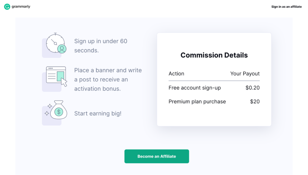
Takeaways: Make it easy for the affiliate to get started and quickly make money. Show benefits.
“Sign up in under 60 seconds” is a great way to get more affiliates to sign up. Paying an activation bonus for placing a banner and writing a post, as well as paying out commission for not only paid accounts but also for free account sign-ups will help motivate the affiliate to take immediate action.
While not a pure B2B example, as Grammarly serves both B2C and B2B audiences, their affiliate program page is still a great example for B2B companies to learn how to effectively highlight the many reasons why an affiliate would want to promote Grammarly, such as their “High conversion rates (20 – 30%”) and “extra generous 90-day cookie window”
Grammarly also highlights their “pub(lisher)-friendly keyword bidding policy” that permits affiliates to promote Grammarly with paid search ads outside of Grammarly’s brand and core non-brand keywords as clearly outlined on this page.
From the 7 Principles of Conversion-Centered Design, Grammarly applies Principle 4: Show Benefits. They make use of icons to show how quick it is to sign up, what promotional tactic(s) to take, and the earnings that could follow.
Takeaway: Consider testing the common two-column landing page format.
Many landing pages have this two-column format, with the high-level info on the partner program in the left column and the application form in the right column. This setup gives a strong visual cue to the visitor that the next best step is to fill out the form.
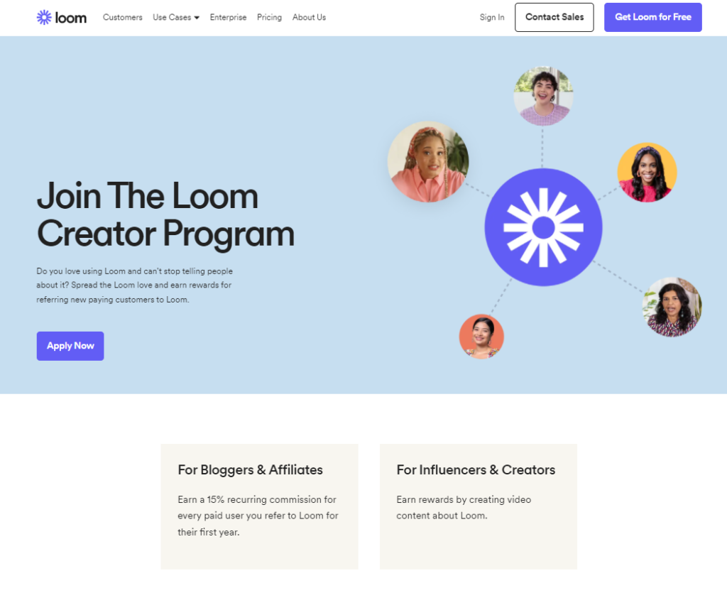
Loom
Note: this screenshot is of a page that is no longer active. in Oct 2023, Loom paused new applications to its Creator program
Takeaway – Consider alternative names to “affiliate program” when naming your program.
By Loom calling their affiliate program the Creator Program, they appeal to more potential affiliate partners who could promote Loom yet might not think of themselves as affiliates. As Loom highlights on its Creator Program page, bloggers, influencers, and creators can all partner with Loom in the same way as an affiliate. Other affiliates see themselves as publishers, advertisers, etc. In an oversimplified way, they all can be seen as “Marketing partners” (though it’s oversimplified because Marketing partners can be resellers, guest bloggers, and other forms of partnerships that do not include affiliate links (an integral part of an affiliate partnership).
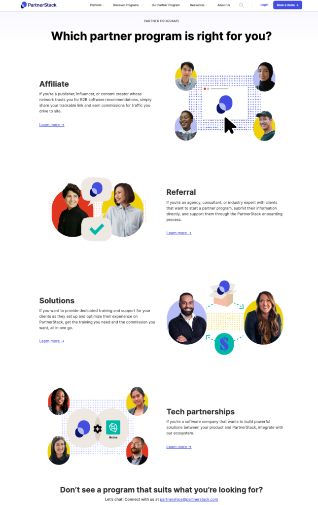
PartnerStack runs affiliate, referral, reseller (solutions), and tech partner programs. By segmenting partner applications by partner program type, it helps potential partners self-select the partner type that best fits them.
To learn more about managing affiliate programs in SaaS, see these resources:
I'm the Founder and Editor-In-Chief of B2B SaaS Reviews and the Director of Demand Generation at PartnerStack, the leading platform for partner management and affiliate marketing in B2B SaaS. My experience spans several notable B2B SaaS companies, including Influitive (Advocate Marketing), LevelJump (Sales Enablement, acquired by Salesforce), and Eloqua (Marketing Automation, acquired by Oracle). I hold a Bachelor of Commerce in Marketing Management from Toronto Metropolitan University and a Master of International Business from Queen's University, with academic exchanges at Copenhagen Business School and Bocconi University.
How to Make B2B Affiliate Partner Program Pages That Convert
Want the latest insights from B2B SaaS Reviews?
Sign up for a bi-weekly newsletter with tips on reviews and review sites. One-click access with any email address. Completely free. Don't miss out on content that will help you get more from reviews 🤩